

Dance Client Case Study
Studio Website Redesign
Making booking easy, showing off the classes, and bringing the studio’s vibe online.
Full redesign
Colour palette
Strategic copy overhaul
Valour Projects
+
Valour Projects +


Director + Choreographer
VALOUR PROJECTS
The CLient
Valour Projects promotes mental health awareness through dance classes, fitness classes, and creative film projects. It aims to normalise conversations about mental health while building a supportive community.
Industry: Dance + fitness + mental wellness
Audience: People looking for fun, supportive classes
Services: Group classes, creative projects, corporate wellness
The Challenge
Kirsten’s classes were already popular, but the DIY website for Valour Projects wasn’t working the way she needed it to. Together, we identified three key problems:
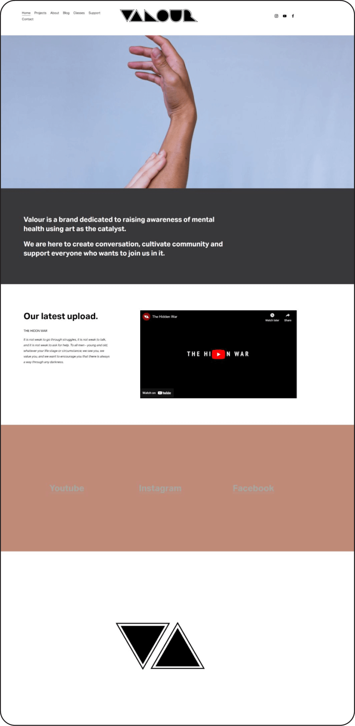
The business had outgrown the website and it no longer accurately communicated her brand.
Without photos and videos, it was hard for visitors to get a feel for the classes, the energy, the skill levels, and Kirsten’s teaching style. We suspected this lack of clarity was discouraging new students from booking.
Functionally, the site layout made it hard for existing students to book quickly, while new visitors didn’t have a clear path to follow.
“I struggled with making my website user-friendly, especially around booking and navigation.”

The Goal
INCREASE ENROLMENTS BY:
Embracing the brand, bringing the classes to life, and simplifying booking for new and returning students.
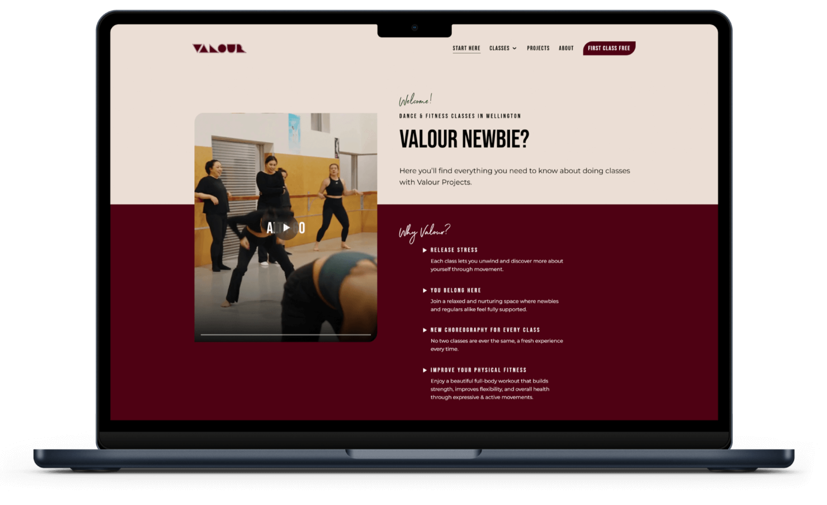
Brand that Pops
We refined the colour palette, chose a bold, impactful font, and added repeated motifs to bring the Valour Projects vibe online.
“The website looks professional and polished while still reflecting my personality and brand.”
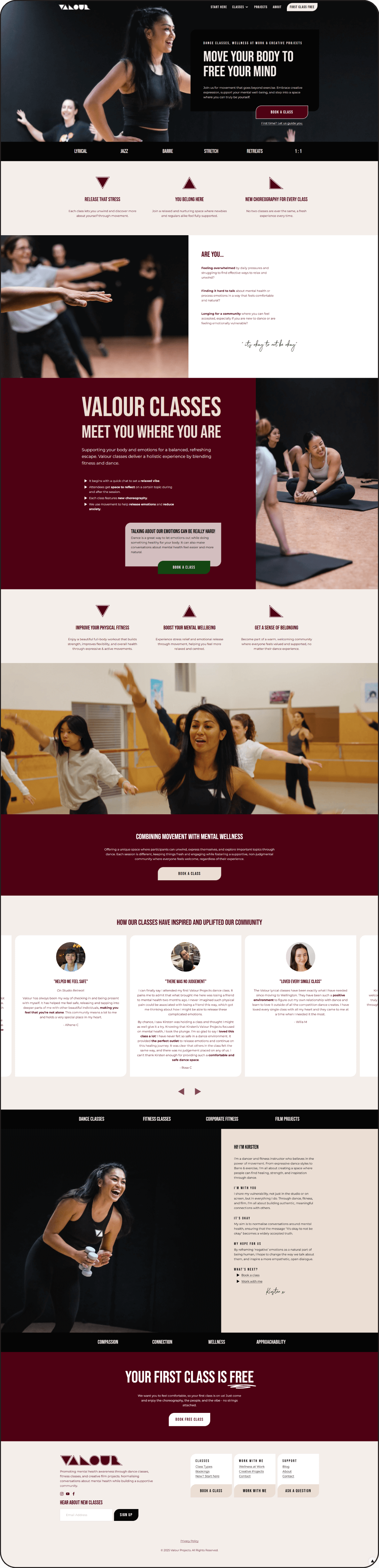
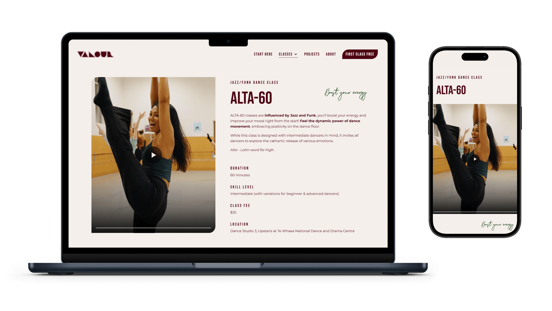
2. Show the Classes
Video became the hero. Horizontal videos on main pages and vertical clips on class pages let visitors see exactly what a class is like, helping them feel confident about joining.
“Jen took the time to truly understand what I wanted, even when I wasn’t sure myself.”
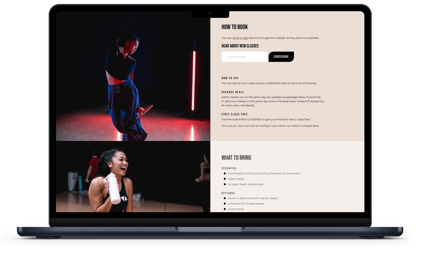
3. Make Booking Easy
Two visitor journeys: new and returning students. Added a friendly welcome page, highlighted the first-class-free offer, and simplified booking.
Results
+
Feedback
+
Results + Feedback +
Results
An influx of new student bookings
Bounce rate down 23% in the first month
Booking is now quick, clear, and stress-free
The site now reflects the studio’s brand
User Feedback
Here's what some of Valour Projects' community members had to say about the new website.
“I found it easy to navigate, lots of photos and videos which makes it interesting...”
“Love! Easy to work around. Love the layout! And the about page! Easy to navigate :) ”
“Very easy to navigate and the user experience is super smooth and easy. It's really well put together and I love the aesthetic.”
“…and I love the consistency in your branding , colours and fonts look amazing together…”
“…User experience is great and you really get a sense of your personality.”
“…Love all the short clips of you and I think you really get an idea of the vibe of your classes from those.”
“New website is great! It looks super professional…”
Client Feedback
What was it like to work together? Kirsten shares her thoughts.
What was the process of working with me like?

“The entire process was seamless! You made everything stress-free and easy to follow, guiding me through each step with clarity. I always felt like I was in good hands.”

What surprised you most about working together?
“How EASY you made everything! Every change, every personalised tweak—done so effortlessly. You took my vague ideas and somehow turned them into exactly what I wanted (or better!). You totally exceeded my expectations.”
What would you say to someone considering working with me?
“Do it! Jen is thorough, professional, and genuinely invested in understanding her client’s needs. She makes everything feel effortless while delivering top-quality work. Plus, working with her feels like collaborating with a friend — supportive, easygoing, and stress-free!”
Start your project
+
Start your project +
dance website Design
Custom websites that reflect your brand, attract new students, and make managing your studio easier.
Grow your studio with more enrolments
Impress parents with modern, mobile-friendly design
Go paperless with sleek digital show programmes
START A PROJECT
Prefer to chat first?